The Rise and Fall of Cover Flow: A Design Perspective
Cover Flow, once hailed as an innovative UI design for browsing digital media collections, has seen its popularity wane. Initially celebrated for its visually engaging interface that mimicked flipping through album covers or files, Cover Flow allowed users to quickly scan and select from their digital library in a visually appealing manner. However, as digital libraries grew and user needs evolved, the practicality of Cover Flow came into question. Critics argue it prioritizes form over function, offering aesthetic appeal but ultimately slowing down the search process in large collections. This blog post explores the journey of Cover Flow from a design marvel to a less favored interface, reflecting on what designers can learn about balancing visual innovation with user functionality.
Provided by ApplePatents
Cover Flow was a visual feast, turning digital browsing into an almost tactile experience reminiscent of flipping through physical albums. Yet, it's not without its drawbacks—search efficiency and rapid access suffer in the wake of aesthetics. The images reflect a journey from the visually rich to the practically efficient. We see the transition towards list views, which trade the visual spectacle for clarity and speed. This evolution underlines a core UX principle: designs must evolve with user needs, prioritizing function and expedience over visual flair when necessary.
As we transitioned from the visuals of Cover Flow's nostalgic aesthetic, the images presented evoke a time when browsing your music collection was akin to flipping through a tangible album collection. This UI design catered to the tactile and visual enjoyment of users, turning the simple action of selecting a song into an engaging experience.
However, the novelty of Cover Flow eventually gave way to the need for more streamlined, efficient navigation methods. The images highlight a design that, while visually appealing, wasn't without its drawbacks. The Cover Flow required users to swipe through a carousel of options, which could become tedious with a large collection.
The subsequent evolution in design, as seen in the later images, showcases a list-based approach, emphasizing clarity and ease of access. This design reflects a more straightforward, less time-consuming way for users to interact with their digital libraries.
The final image hints at a potential new direction—a spiral UI concept, suggesting a blend of visual appeal with a more practical layout. Such concepts show the ever-evolving nature of design, where the aesthetics of the past meet the functionality demands of the present.
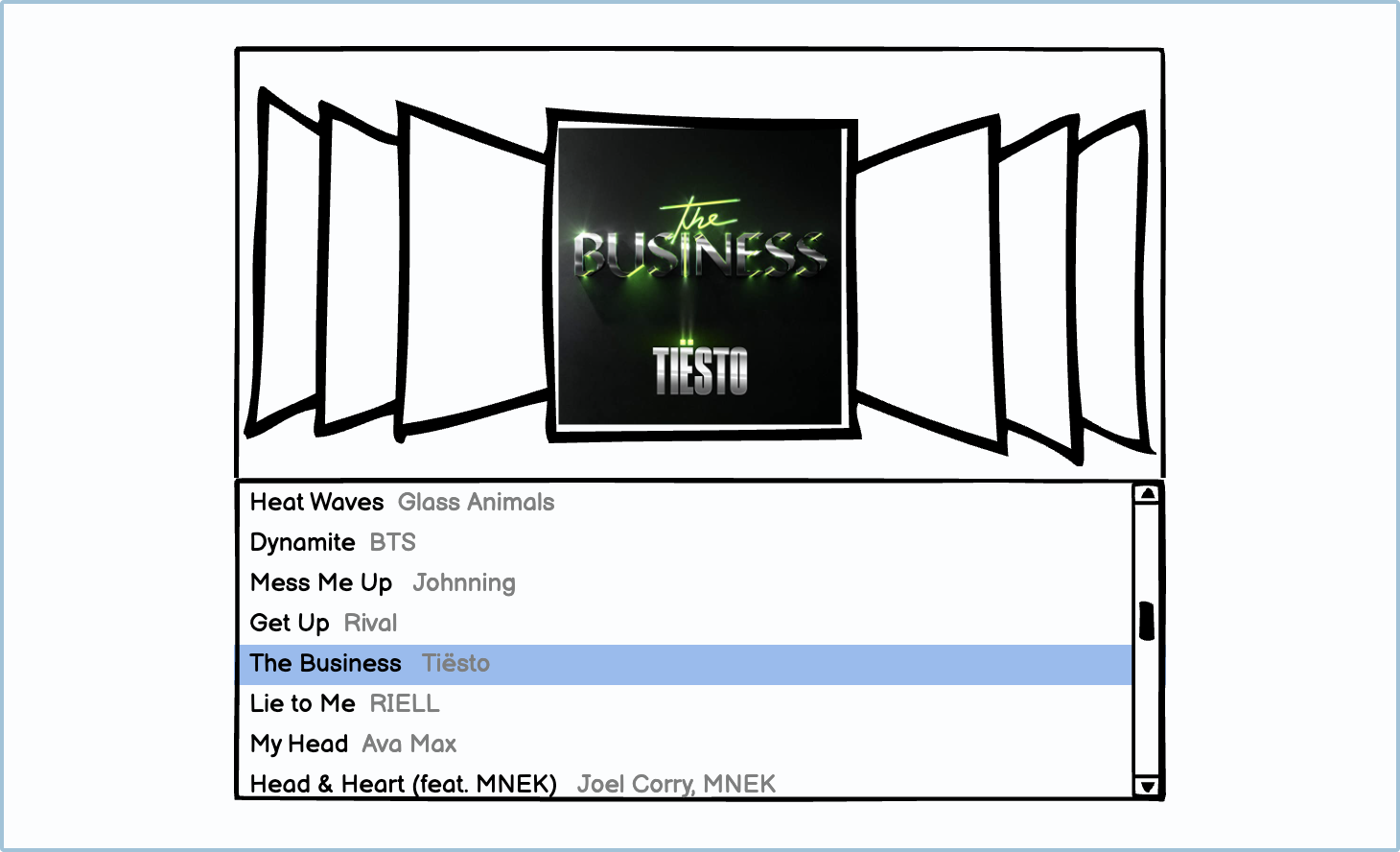
Image designed by Balasmiq
The design journey from Cover Flow to a list view is emblematic of a broader trend in UX/UI design: the pursuit of efficiency and functionality over mere visual appeal. Cover Flow, with its eye-catching carousel of album covers, was a novel way to navigate through music, offering an almost tangible interaction with digital media. It mimicked the flipping through of physical albums, creating a nostalgic and engaging experience.
However, as digital libraries expanded, the practical limitations of Cover Flow became apparent. The search for a particular album in a vast collection could become tedious, and the interface consumed a significant amount of screen real estate without adding functional value. The shift to a list view addressed these concerns head-on. With a simplified presentation, the list view strips away the flourish to focus on the essentials—titles and artists are clearly displayed, enabling rapid scanning and selection. It reflects a design philosophy that prioritizes quick access and information density, acknowledging that sometimes less is more in creating a user-centric interface.
This evolution from Cover Flow to a list view doesn't just represent a change in design aesthetic; it illustrates an ongoing dialogue between how users interact with their devices and how designers can best facilitate those interactions. It's a testament to the dynamic nature of UI design and its constant adaptation to meet user needs.

As we conclude our exploration of UI designs, we've seen the transition from the visually captivating but often impractical Cover Flow to more user-friendly layouts. The shift towards list-based and grid layouts represents a broader trend in user interface design: prioritizing functionality and ease of use over visual flair.
From the more structured list layout that enhances content discoverability, to grid designs that organize information neatly for quick access, UI design continues to evolve. These modern designs cater to the user's need for efficient navigation, reflecting a matured understanding of user experience.
This evolution in design philosophy mirrors the UX/UI community's ongoing quest to balance aesthetics with usability. As we keep innovating, the focus remains on creating interfaces that not only look good but also serve the user's needs effectively, ensuring an intuitive and satisfying interaction with the digital world.