

Company
The future of well-being is here. A better mental healthcare experience.
Snapclarity is accessible, evidence-based, and outcome-driven for an effortless journey to wellness. The digital platform provides a personalized mental health experience where members find the right personalized care, match with the right provider for their needs, and feel both motivated and supported throughout their entire treatment journey. Check out www.Snapclarity.com
My Role
UX / UI Platform Designer
Skill Sets: User Research, User Experience (UX) & User Interface (UI). Designed 2019
my contribution
In August of 2019, Snapclarity, a Canada based company, reached out to me after seeing the work I did for the Magnifi platform. Their idea was sound; an app designed to assist in delivering a personalized wellness journey with tractable metrics and avenues to therapy. Frankly, I don’t know why something like this doesn’t already exist. As a proponent of therapy and mental health awareness, It was an exciting opportunity. The team was small, agile and passionate and we were able to get started immediately.
Hypothesis Statement
Whenever I begin a project there are a few steps I take to ensure the teams efforts have a firm foundation. Before anything else, it is important to form a hypothesis. This is the basis of what you will gather information on later proving or disproving through user testing. Mental Health and well being is a staggering complex concept. Certain apps seek to solve siloed sectors of mental health, like “Calm” for meditation practices or “BetterHelp” for finding a therapist.
Problem Hypothesis
Finding a single phone app that can help with building health habits, getting and maintain contact with a therapist, creating greater awareness of your mental state and provide meditation and other healthy activities is complicated.
Customer Hypothesis
Students, recent widows, the over stressed and over worked, the depressed, the anxious, and anyone suffering from an acute trauma.
How do we test this?
Talk to people. I worked with a registered psychologist and the SnapClarity team to formulate a series of questions to be proposed to our test audiences. Some were quantitative, like people’s ages, nation of origin or gender identity. Others were open ended making up the qualitative part of the study like: “What would a ‘mental health journey’ mean to you?” ,“Tell me about a time you sought mental health support.” The initial test audience was cultivated via online forums like Reddit. This helped us refine our questions before moving to a second stage. I spoke earlier about SnapClarity being a Canadian based company. In Canada, mental health support is considered as vital as universal healthcare and the culture around it is significantly less stigmatized than America. For our second stage, SnapClarity’s HR team drafted a letter to a series of companies that had been published in a paper titled “The 10 best and worst companies to work for if you value your mental health”. The letter was inviting them and their employees to participate in a study designed to refine and design better tools in the pursuit of better mental health. We were impressed 14 companies volunteered and sent their employees a link to our online survey. Phase three of our research involved having in office interviews with another group of people who did not participate in phase one or two.
Quantitative Results
There were a total of 1069 participants. Here is a small sample of the results I compiled from my three phase study.
Participants by Gender Identity
Age distribution
Nation of Origin
"Have you ever recieved therapy based mental health support?"
Type of work
"Were you ever unable to find mental health support in a time of need?"
Qualitative Results
From our qualitative questions, we distilled common stories and answers into user persona’s. Please note, in order to protect the identity of our participants, I had to mock up the following user persona’s to be able to display them. These persona’s are not meant to portray real people but are designed to give an example of what our persona’s looked like. With help from our psychologist, I crafted a total of 40 user persona’s to help with the next step in our research.
User Persona’s
Expectancy test hypothesis
Distilling the complex nature of mental health into verticals that could be displayed in the app as different pages, we laid out content with how we thought our different persona’s would interact with the it. This was designed to give us a basis, or a hypothesis, to test once we had the pages better defined and I had a prototype ready to be interacted with.
Note: Since the “Progress” page would be pulling data from the health apps on Android and iOS, every user would technically be using it so we did not prescribe persona’s to it.
Other configurations we considered.
The wire-frame
Looking at our research thus far, I laid out the clearest elements in Balsamiq and designed a very basic wire-frame. We knew from the beginning we wanted to nest the navigation as a series of buttons on the bottom of the app in a similar vein to social media networks like Facebook, Youtube and Instagram. We knew that the order we placed these buttons in would drive emphasis and could change how users interacted with our services. We called 15 of the onsite test subjects, from phase three of our user research, back into the office. I conducted a simple A / B test to gain insight into how people would use the app with the buttons, and there for pages, arranged differently.
Early version of the Balsamiq mock-ups before refinement
Getting the right look
The team original wanted to take things in a very saturated but dark direction visually. They initially liked the look of the “Calm” and “Sleep Watch” apps on iOS.
Establishing the Visual Identity
I was working closely with the marketing department, creating iterative visual designs for the App, when the idea hit me. All of our marketing material made great use of white space. The team wanted a heavier, darker looking visual design for the login screen because of how it was being presented in their decks. I thought the idea was very informative.
We had been so outwardly focused on our target audience, and the research data, that I had never A / B tested our own team. I quickly created a lighter version of our home screen and splash loader and sat each member of the team down to get their feedback. After using the prototype I had made. We started moving in a lighter direction.
Softer and lighter
These are some of the examples used in our A / B tests to arrive at our final, lighter and softer look.
Version 1
Version 2
Version 3
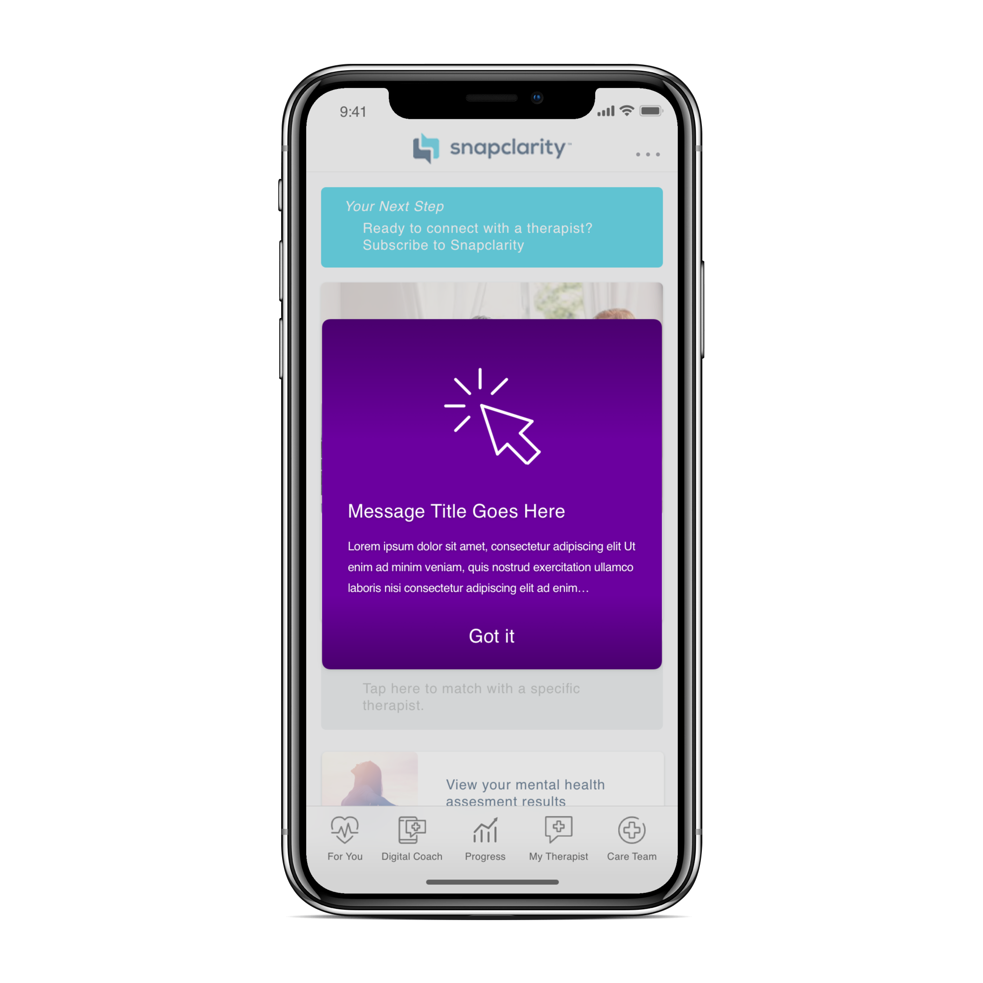
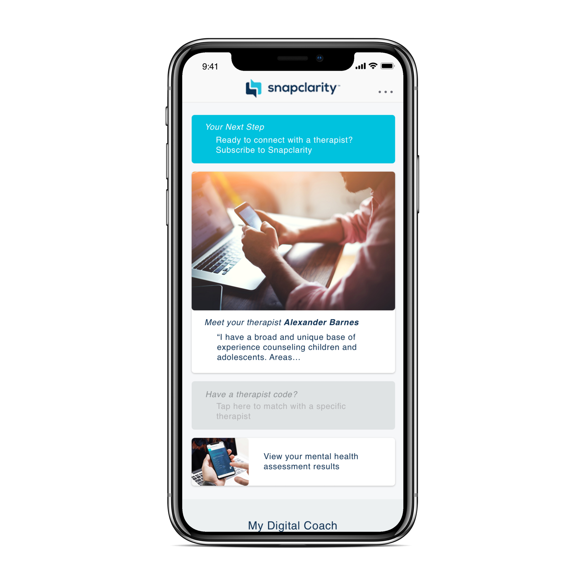
The Deliverable
Using Sketch and Zeplin, I delivered a series of prototype screens and an icon library to Snapclarity’s engineers. The following are some of the final delivered assets.


Snapclarity is a digital platform that offers a personalized mental healthcare experience, empowering users to achieve a better well-being. I built upon evidence-based practices and designed it to be accessible and outcome-driven, Snapclarity guides members on an effortless journey towards wellness. The platform offers personalized care recommendations, connects users with the right provider for their specific needs, and provides ongoing motivation and support throughout the treatment journey. With Snapclarity, users can trust that they are receiving the right care, at the right time, from the right provider, ultimately leading to improved mental health outcomes. Learn more at www.Snapclarity.com.
